In this section, you will learn how to use Slideboards and Gridboards.
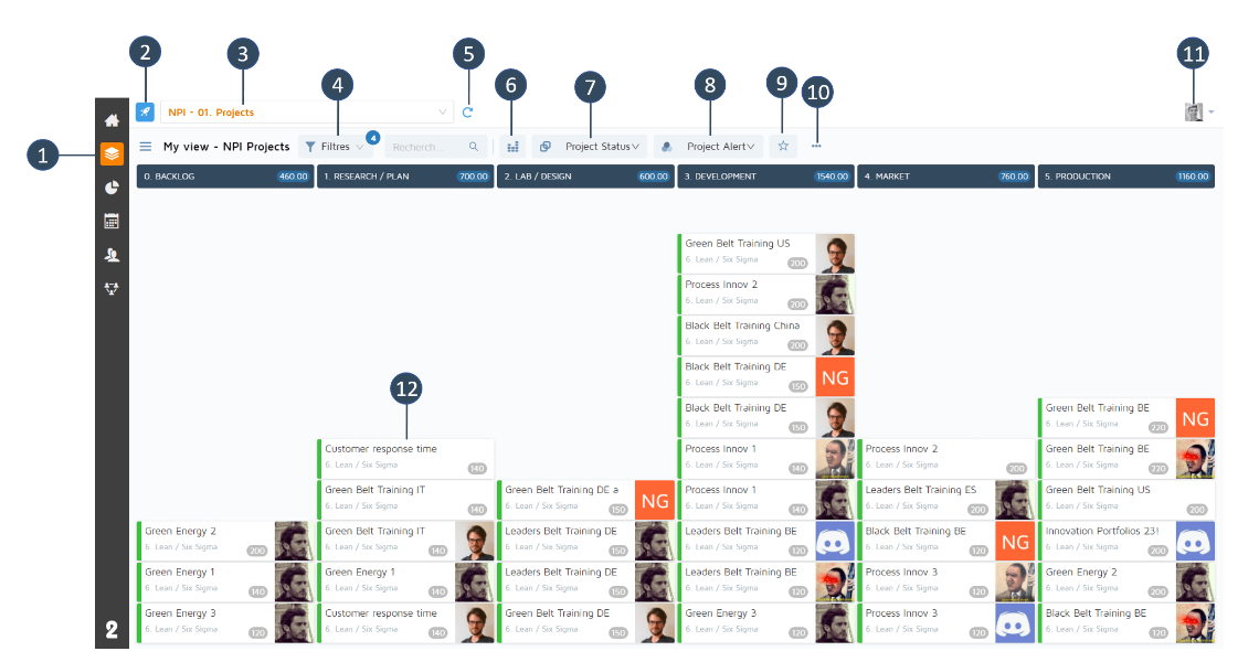
Module Board (Slideboard/Gridboard)
Icon of the type of object model ("Project" in the example above)
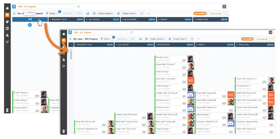
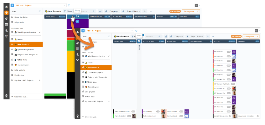
Slideboard/Gridboard selector already configured
Filters bar
“Refresh” button to update the data of the Slideboard/Gridboard
Slideboard view/Gridboard view
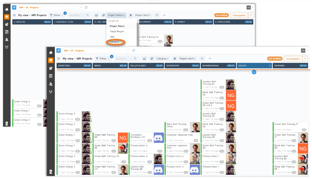
List of choices for grouping the columns of cards contained in the Slideboard
List of color choices for grouping continuous cards in the Slideboard
Add the view to favorites
Menu for share / rename / delete the view and access its properties
Change of profile picture/logout
Closed Slideboard card
For more information about filtering a Slideboard, refer to the Filters user guide.
Histograms are automatically formed when the size of your screen no longer allows the display of cards . A (configurable) functionality of histograms is sorting according to the grouping by color that has been defined.
In the example below, the grouping by color is done by “Target Region”. When hovering over the green parts, a tooltip indicates that these spots are assigned to the “Europe” zone. By clicking on this part of the histogram, a sort is then set up on the spots with the target zone “Europe”, and a filter “target zone = Europe” is added in the filters menu.
A system of column collapse is possible as soon as you hover and click over the column header (see below). To go back and make a column bigger, just go back to the column header to do the opposite.
This option can also be used to display the cards in the case where the columns are in “histogram” mode, for instance when a column contains too many cards to display them all:
Multiple columns can be collapsed, except in the case where all columns are collapsed.
When the card creation is activated, a “+” button appears under the name of each column of the Slideboard. By clicking on it, a creation block appears. Depending on the settings, you must enter the card's title and other information. The fields required to create the card are indicated by a small asterisk. Click on the "Create" button to validate. Once the card is created, it stacks on top of the other cards in the column.
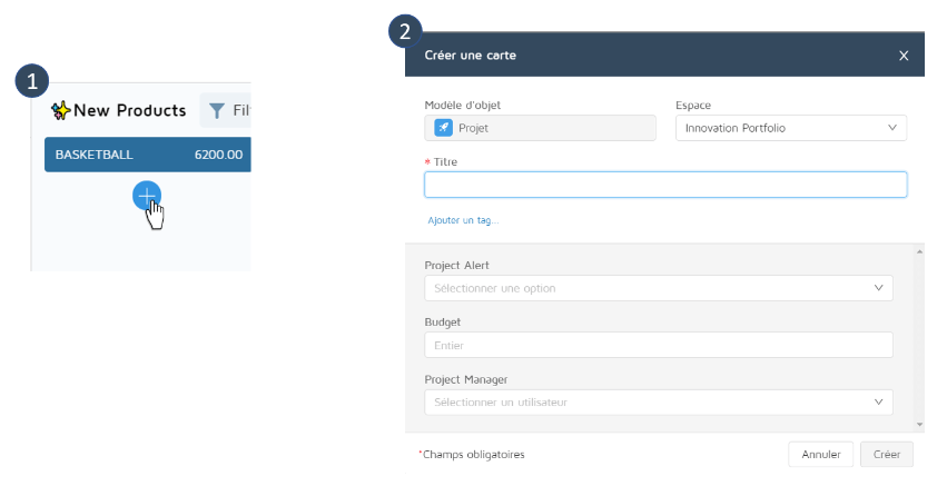
The card will be created in the same space as the Slideboard form.
From the Slideboard, it is possible to access certain additional information on the card without having to open it.
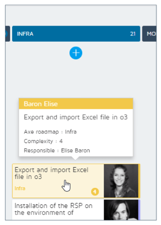
To do this, all you have to do is hover the card. The information configured by the administrator for the closed card will be displayed, such as the name of the manager, for instance.
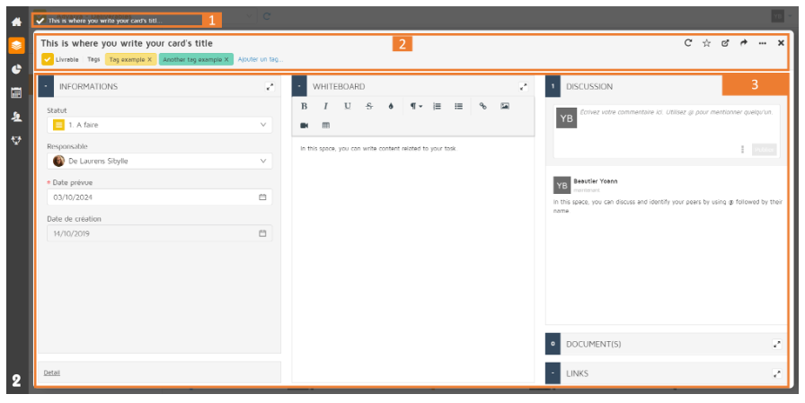
Breadcrumb: It allows you to navigate to the parent, and the parent of the parent of the map.
Card header:
Card Title
Tags interface
Refresh button
Open in a new tab button
Share button
Option to delete card and show activity feed
Content of the card:
The content of the card varies according to the configuration carried out upstream, and the blocks can be of different types according to the need.
A form block containing information about the product or the task to be performed.
A text block with layout that also lets you share photos, links, and content related to the task or product.
A social block to discuss the product and identify stakeholders so that they are notified of your message.
A document block allowing you to add documents related to the product, Powerpoint presentations, videos, etc.
A sub-list block allowing you to open and consult tasks directly from a map.
A custom block allowing to add an external application, an iframe etc.
The number of blocks displayed (from 1 to 4) depends on the size of your screen. For each of them, it is possible to use the block display in full screen. On maps that contain many blocks, you can use the block selector at the bottom right, which will temporarily open on top of another block.
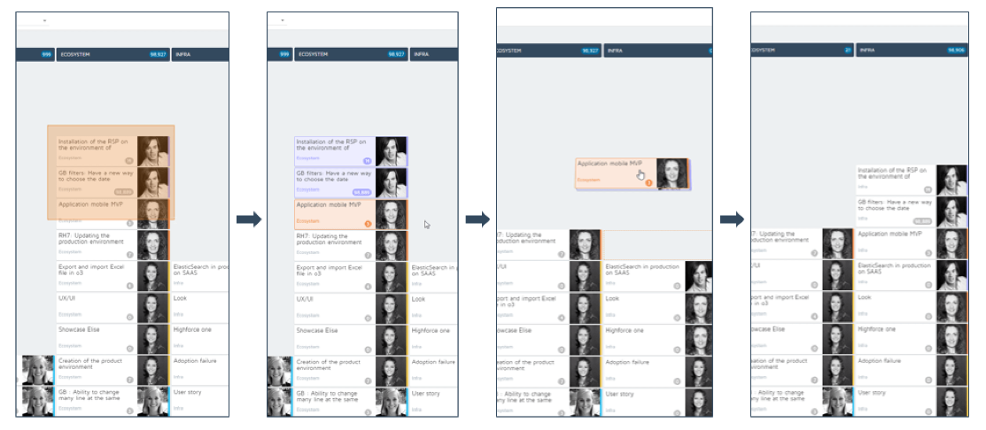
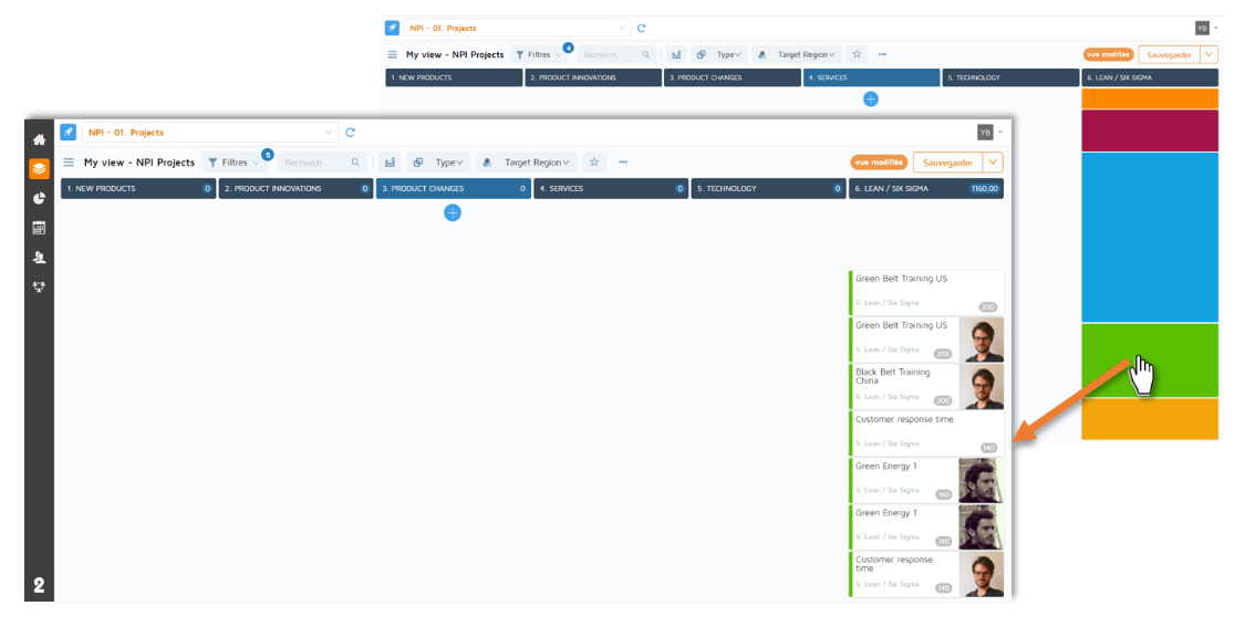
The drag & drop functionality works on a card but also on several cards juxtaposed in the same column. The example above shows this second case.
To move a single card, simply hold down the mouse button on the selected card in order to drag and drop it in the desired column.
To move several cards, the principle is the same, but you must first select all the cards you want to move (once selected, the cards are colored).
You cannot display more than 4 columns in a sub-list block in normal display. To see all the columns, you must display the block in full screen.
When drilling down in a Slideboard, there are only 3 possible levels.
Ex: the programs Slideboard will contain project cards which will contain milestone sub-cards, but you won't see the actions linked to these milestones.
In the Slideboard, it is not possible to group together on multi-value fields.
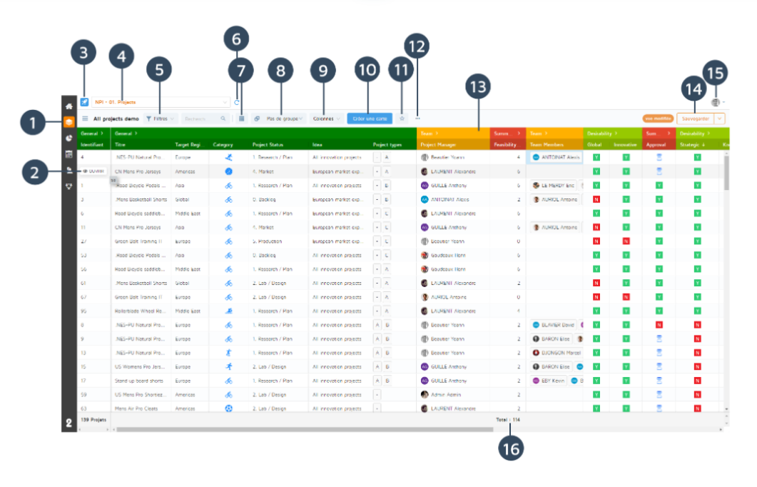
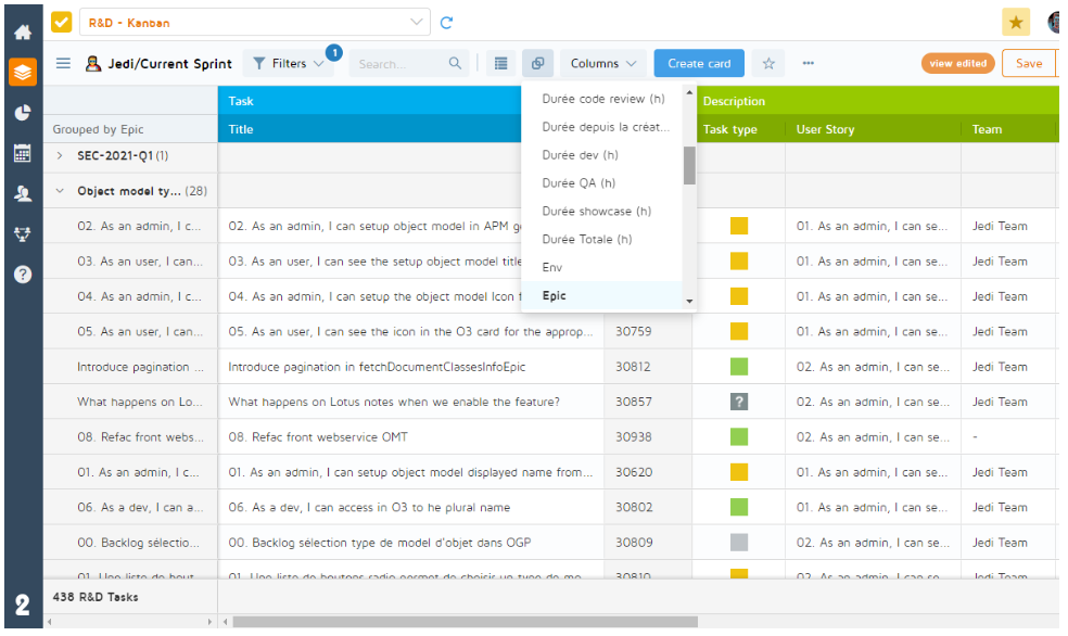
Board module (Slideboard/Gridboard)
Open a card button. Appears when the user hovers over a row.
Icon of the type of object model ("Project" in the example above)
Slideboard/Gridboard selector
Add or remove filters
Refresh the board
Gridboard/Slideboard view
Group by column
Selection of columns to display
Card creation button
Add the board to your favorites
Options menu:
Export all columns
Export displayed columns
Import
Sharing and view properties
Pin view
Rename view
Activate/deactivate Gridboard V2
Columns and groups of columns
Save the view settings
Change profile picture/log out
Total (only displayed for numeric fields)
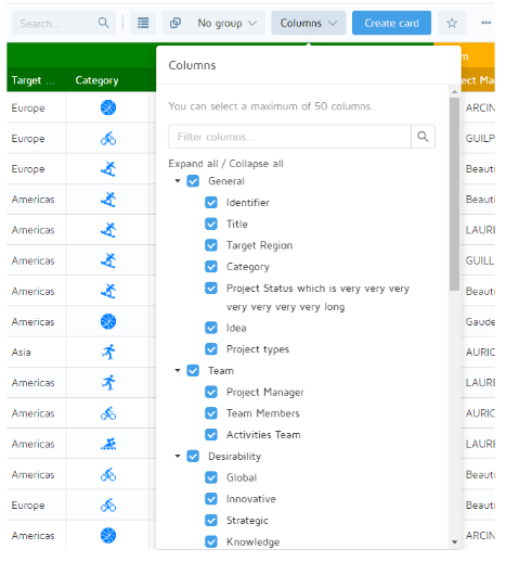
Columns: The Gridboard allows you to display data in tabular form. This table is composed of columns and the administrator can configure as many columns as needed. However, the number of displayable columns is limited to 50 for a Gridboard.
You can resize a column by clicking on the border separating the columns and dragging it to the right or left.
To auto-resize a column or a group of columns' width, you can double click on its right border header.
Column colors: The default column color is orange and is not configurable. Color is configurable on the level of column groups.
Column groups: A Gridboard can contain one or more group(s) of columns and each group of columns can contain one or more column(s). The administrator can configure the columns and choose the display color as well as the columns present in each group of columns. It is possible to hide groups of columns in order to gain visibility.
Columns display: It is possible to display up to 50 columns in a Gridboard and to choose which ones from those already configured. To choose the displayed columns and/or groups, use the Columns menu (13).
Changing the order of columns: It is possible to change the order of the columns by dragging and dropping the header towards the wanted direction. If you save the view, this setting is included in the saving.
Navigating through columns: You can use a horizontal scroll to navigate through the multiple columns of your Gridboard.
Pinned columns: To avoid losing context, the first column is pinned by default so it is always displayed when you scroll right in your Gridboard. It is not possible to pin another column by dragging it to the left. To change the pinned column, you can use the column selector and hide the columns before the one you want to pin in the column order.
Grouping columns by: For better readability, you can group columns by field using the "Group by" menu located in the header (8).
When grouping, the rows are rearranged into groups accordingly. Row counters are shown in parentheses and numeric column totals are shown on each row in bold.
Grouped rows are collapsed by default, you can deploy them by clicking on the small arrow in the grouping column.
Sorting columns: Columns can be sorted in alphabetical order A-Z and Z-A by clicking on the column's header. Alphabetical sorting is applied by default on grouped columns. For multi-sorting, use keyboard shortcut Shift+ click on the column's header.
If you sort a multi-value field that is a document, text or list-picker type, the values of the field are concatenated. (for example: Europe;Asia;Oceania becomes EuropeAsiaOceania.)
If you sort on a multi-value field of any other type than text, the first value is taken into account for the sorting.
Saving a view in Gridboard: When you save a view using the "Save" button (14), the following settings are saved:
Displayed columns and their order
Grouped by columns
Column width
Sorting
Filters
Totals: For numeric columns, the total is displayed at the very bottom of the column (16).
For more information about Gridboard filtering, refer to the Filters documentation.
Card creation: If you have the right to create a card, you can create one directly from the Gridboard by using the creation button in the header (10).
In-line edition: You can edit any fields including multi-values fields, but you cannot edit read-only fields.
To edit a cell, double-click on it to make it active. To validate the edition, click outside the active cell or press "Enter" on your keyboard.
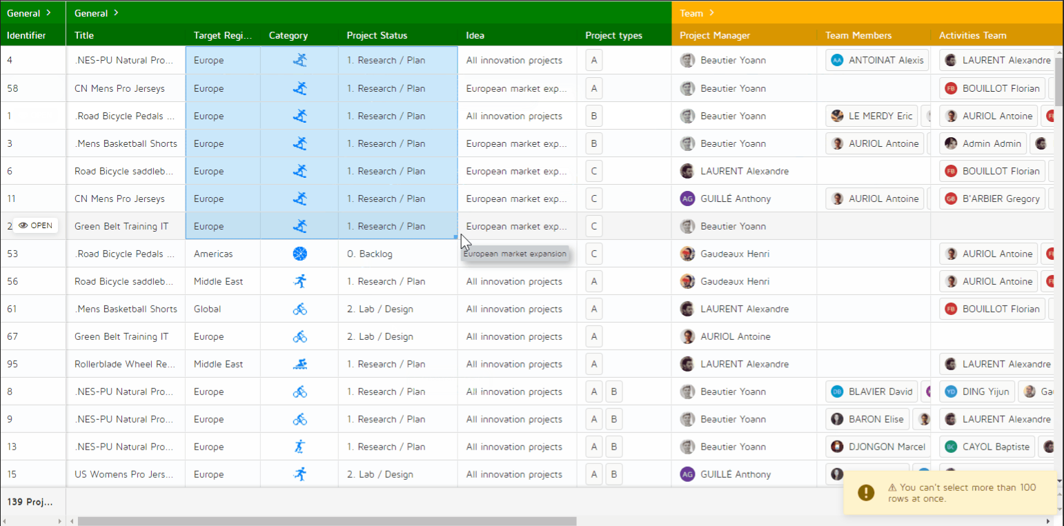
Bulk edition: You can edit multiple cells at once in Gridboards. Select one cell or more and drag it/them from the bottom right corner to update multiple cells at the time, within the limit of 100 rows for each bulk edition.
You can select multiple columns or multiple rows to apply a pattern, as described in the following gif.
You cannot bulk-edit read-only fields.
If you try to edit more than 100 rows at once, no row will be updated.
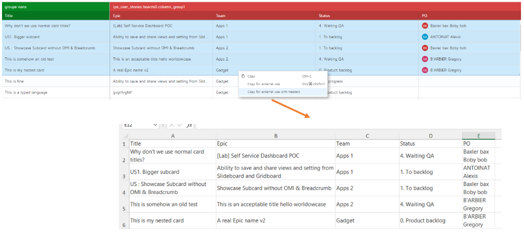
Copy-paste: You are able to copy and paste directly in Gridboards and Sub-lists using right-click options or Ctrl+C (copy) and Ctrl+V (paste). The feature works similarly to Excel.
You can select one cell or multiple ones by dragging your mouse over columns or using Shift+keyboard arrows to widen the selected area. There is no limit in cells selection.
Copy-pasting works on every field type, including multi-values fields and you can do it from a text field to another text field. Same for number fields. Only the field type must be the same.
Limitations: If you copy multiple non-following cells, pasting will not take into account the fact that they are not following, as it does in Excel. However, if you copy one cell and paste its value in multiple non-following cells using Ctrl+click, the value will be correctly updated in these cells.
Copy-paste for external use: You can paste the content in Excel or Teams and it will be readable, with no metadata.
To do so, you can use the right-click menu in your Gridboard or the keyboard shortcut Ctrl+Shift+C (Cmd+shift+C on Mac).
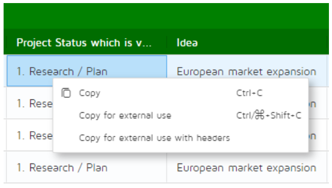
If you select the option "Copy for external use with headers", the title of each column will be included in the copy, as you can see in the following example.
All the detailed information regarding the import/export of the Gridboard can be found in the guide: Excel import/export in Gridboard.
The difference between "copy" and "copy with headers" is the format output from the clipboard. As this is in CSV, the former will only copy cell values while the latter will add column names.
Duplicate columns during grouping: During grouping, you can observe that the grouping column (the first from the left which is fixed) appears twice. This is necessary to make changes in the field. The grouping column is only present as an indication to know on which line we operate by scrolling to the right of the Gridboard.
Bulk-edition is limited to 100 rows. If you try to edit more than 100 cells at once, no cell will be edited.
Pinned column: You cannot pin more than one column. The pinned column is the first one by default.
Limitations on sorting: Sorting on an enum or document field can be different when displayed in a Gridboard compared to Excel display from an export when the board contains less than 1,000 rows. In a Gridboard containing less than 1,000 rows, the sorting is done on the translated value displayed in the cell (example: Status - Ideation). Beyond 1,000 rows and in all Excel exports, sorting is done on the untranslated value of the cell (example: "value":[{"value":"ideation"}]).
If the translated value is different, the sorting displayed in the Gridboard compared to that in the Excel table will be affected.
It is therefore technically possible for an enum field to match the value and its translation through configuration to obtain the same sorting in Excel exports as in the Gridboard display. This is not possible in the case document of the field.
Keyboard shortcuts:
Open a card in a new tab: | Ctrl+Click on the "Open" button from a sub-list or Gridboard |
Close an opened card: | Esc |
Make a cell active for edition when navigating with keyboard arrows: | Enter |
Line breaks in active cells: | Shift+Enter |
Multi-sorting - Primary and secondary filters: | Shift+Click on the column's header |
Navigate between opened cards: | Keyboard arrows (Up & Down) |
Navigate to the right end of the Gridboard: | Ctrl+Right arrow |
Select all cells: | Ctrl+A |
Select multiple non-consecutive cells: | Ctrl+Click |
Copy (to paste in a Gridboard): | Ctrl+C or right-click menu |
Copy for external use: | Ctrl+shift+C or right-click menu |
Paste: | Ctrl+V |
Different ways to select cells for copying / pasting:
Dragging your mouse over columns
Shift+Click on the top of your selection, then click in the very bottom of your selection
Shift+Keyboard arrows: Widen selection from an active cell
Ctrl+Click on non-consecutive cells
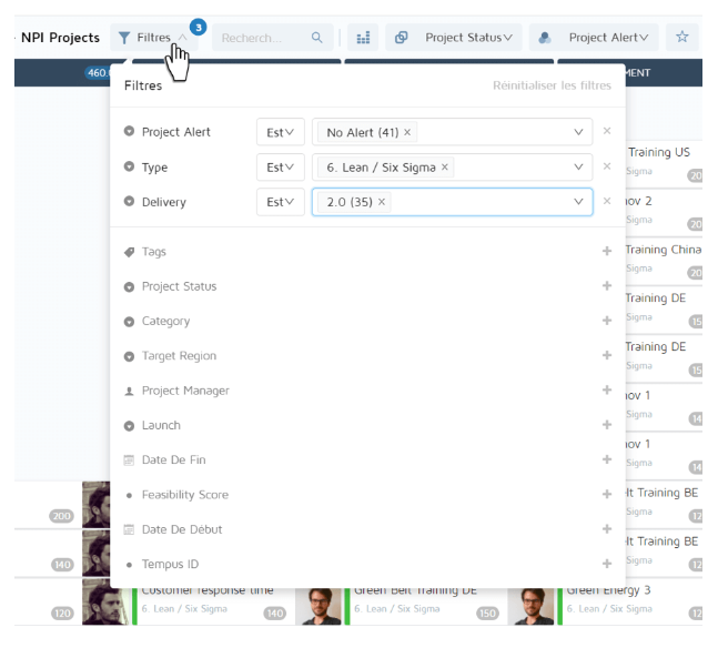
Every field of a given object can potentially be used to filter a board. However, the selection of filters available for the user is set by the administrator during configuration.
The Filters panel is made up of different sections:
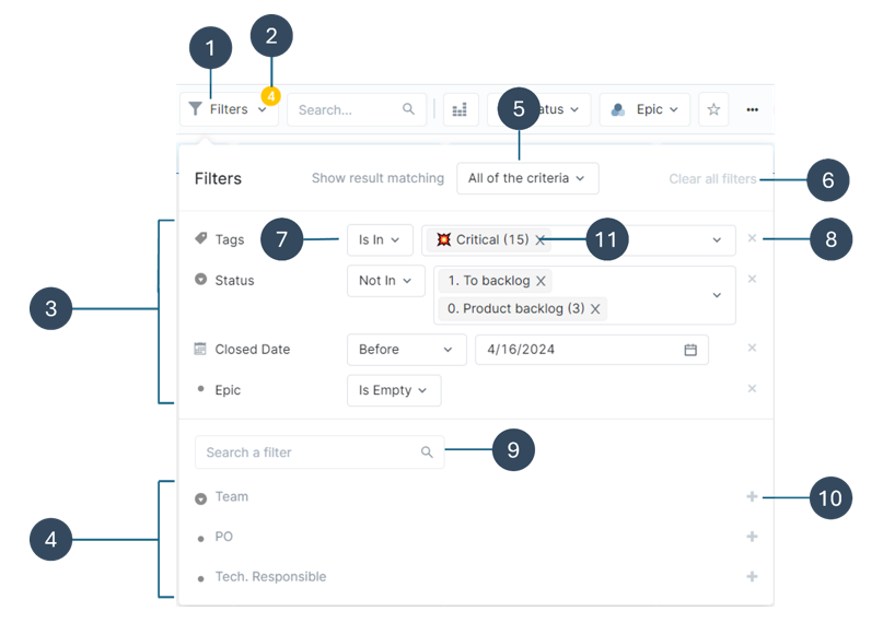 |
Open and close the Filters panel
Number of active filters
Active filters
Non active filters
AND/OR operator condition switch
Clear al the active filters
Inclusion operator
Deactivate a filter
Filter search
All a filter
Occurence counter (number of cards per value)
There are different filters types characterized by their icon.
| List of options | Filters possible values have been previously defined by the administrator. |
| Users | List of all the users filled in the current board cards. |
| Dates | There are two different types of date filters:
|
| Object link | List of all the object link fields filled in the current board cards. |
| Text field | List of all the values in text fields filled in the current board cards. (for instance, Project code). |
| Tag | List of all the tags created in the current board cards. |


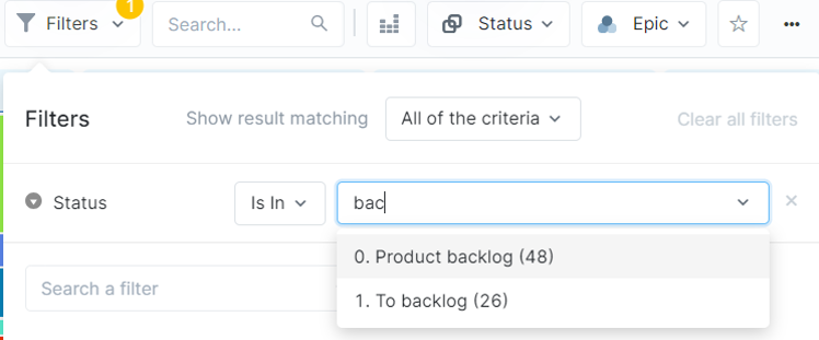
Filters values can be selected through the dropdown list. This list can be filtered by typing a string of characters. Only values containing this string will be displayed in the list, regardless of the string location in the value.
 |
After adding or deleting a value in a filter, data is instantly updated.
The Search a filter input can be used for long lists of filters, to allow users to quickly find what they are looking for.
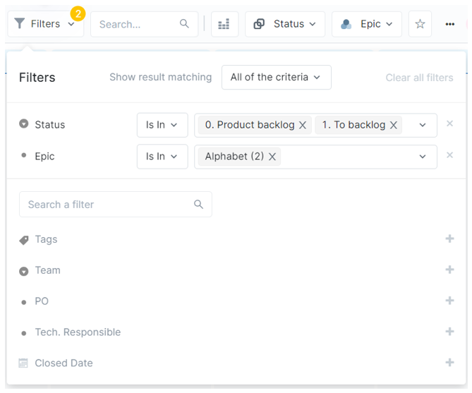
By default, the filtering condition that operates between the criteria is “And” (to show results matching all of the criteria). This means the results match all the different filters types selected in the Filters panel.
In the example below, the objects which will be displayed have “Product Backlog” or “To backlog” as Status AND an Epic that is “Alphabet”.
 |
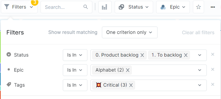
When "One criterion only" is selected, objects are filtered when they comply with at least one of the different filters fields selected.
If users select “Show result matching one criterion only”, the filtering condition operating between the criteria Status, Epic and Tags is “OR”. This means that the objects which will be displayed have “Product Backlog” or “To backlog” as status, OR an Epic that is “Alphabet”, OR a tag that is “Critical’.
 |
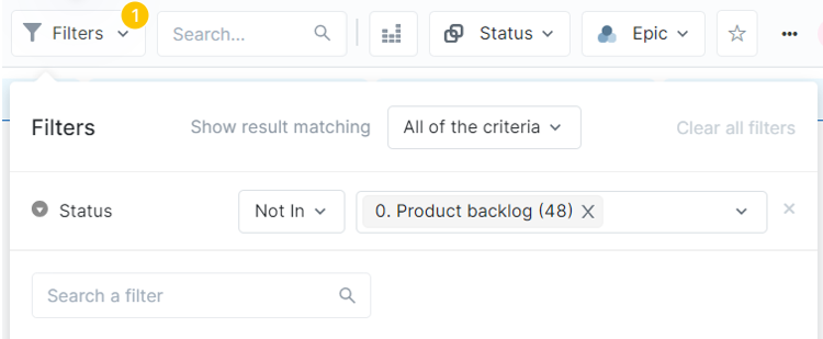
By default, filters apply to the selected values, meaning the inclusion operator is “Is in”. It is also possible to exclude values using the “Not in” or “is Empty” operators.
In the example below, all the projects will be visible except those with the status “0. Product Backlog”.
 |
The operators “is in/not in” or “is empty” can be used for multiple filters and are saved in the view. “Is in” and “is not in“ are not available for date filters.
The operator “is empty” filters the objects for which the field is empty or has “-“ as only value. For instance, if users are looking for all the objects that have no closed date indicated, they can filter “Closed date” with the operator “is empty”.
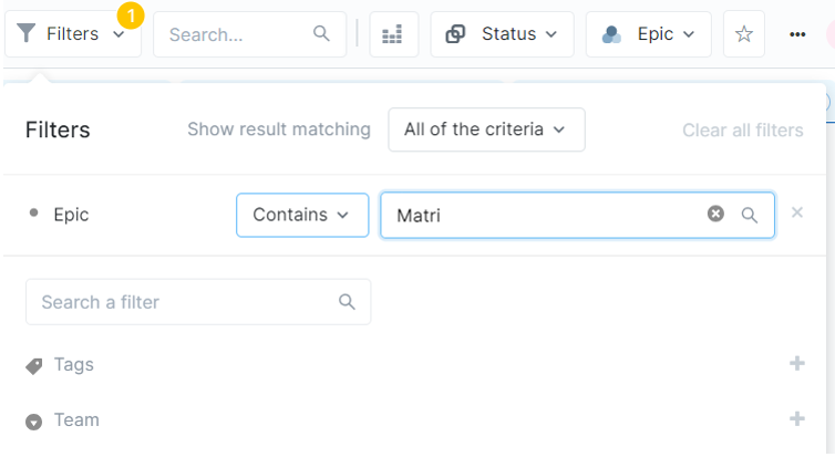
The options "Contains" and "Does not contain" are also available in the Filters panel.
When selected, the dropdown list switches to a search field. The input is validated when users press the "Enter" key or click outside of the input zone.
 |
This operator is not available for the following fields:
Enum fields
Tag fields
Date fieds
For the selected field, all the objects which contain the entered chain of characters will be filtered.
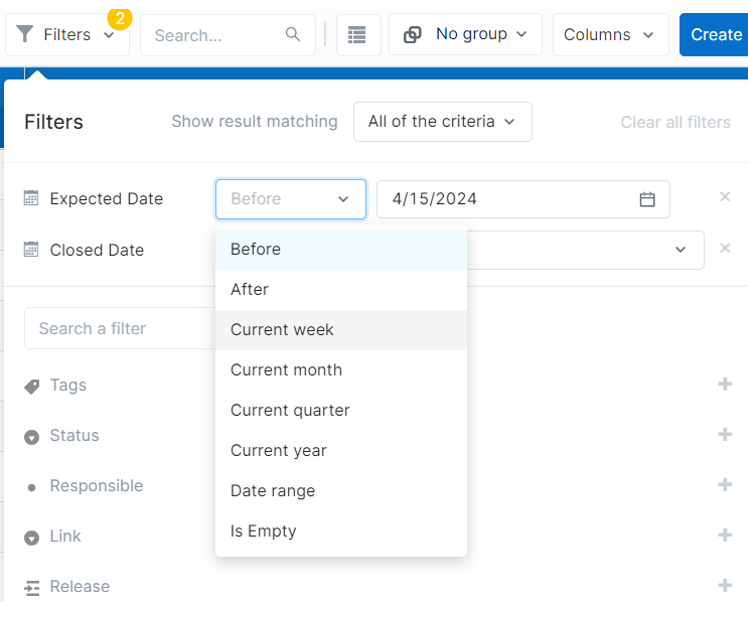
Users can filter objects by date according to the following criteria:
Today
Before (a specific date)
After (a specific date)
Current week
Current month
Current quarter
Current year
Date range (from a specific date to a specific date)
Is empty (no date specified in the field)
 |
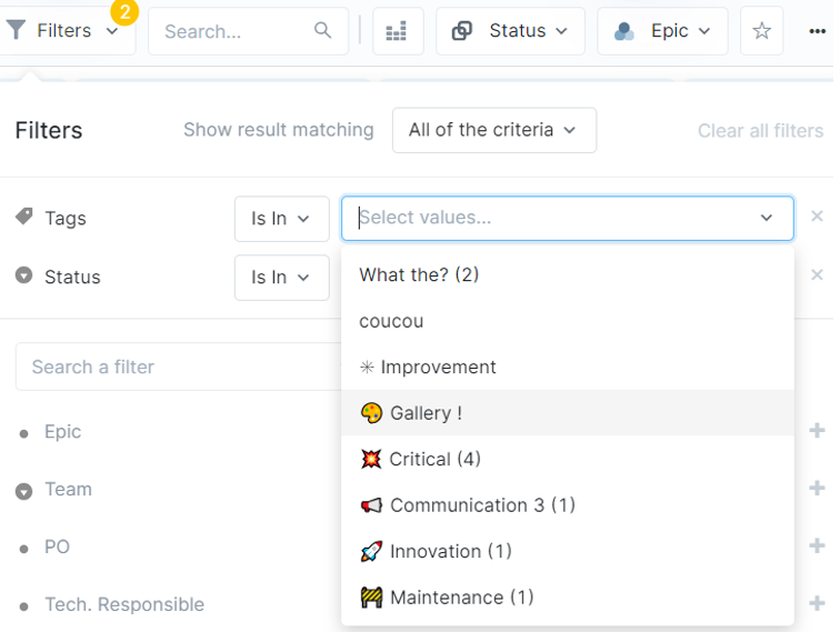
Occurence counters (numbers in parenthesis) allow users to know how many cards belong to a filter value. When no card belongs to a given filter value, it appears greyed out in the filter value list. Users can still select it however, as there may be some in the future.
If users already have one active filter, the occurrence counters for the next filters are impacted by the outcome of the filtering. This helps narrow down searches by showing queries where data exists.
 |
In the example above, if users filter projects which have a status other than “0. Backlog”, then add the “tags” filter, counters in the tags values list reflect the amount of objects whose status is “0.Backlog”. Tags where no object meets this criterion will not display any number in the counter.
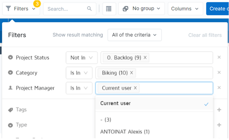
User type filters offer the current user value. Objects displayed as a result of this filter will dynamically match the connected user for this field. This allows to save shared views adapting to the logged in user.
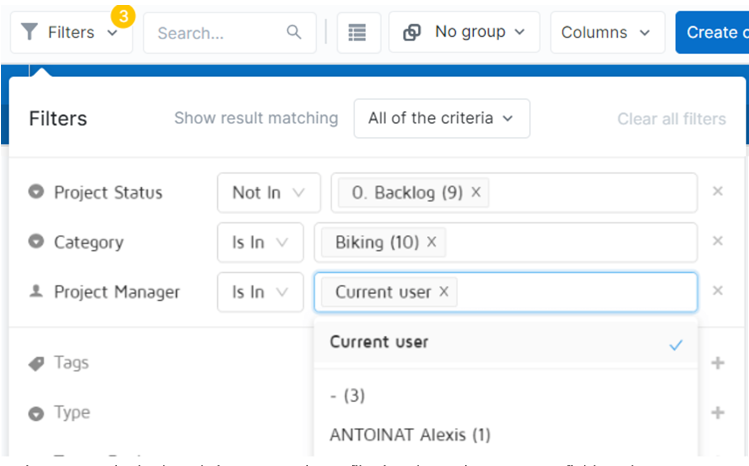 |
For instance, a single shared view “My projects” filtering the Project Manager field on the current user can be used by multiple team members. Team members will not need to create their own view filtered on their name.
It is possible to combine the current user value with other users in a filter, as well as with exclusion operators.
 |
Every field of a given object can potentially be used to filter a board. However, the selection of filters available for the user is set by the administrator during configuration.
The Filters panel is made up of different sections:
|
Open and close the Filters panel
Number of active filters
Active filters
Non active filters
AND/OR operator condition switch
Clear al the active filters
Inclusion operator
Deactivate a filter
Filter search
All a filter
Occurence counter (number of cards per value)
There are different filters types characterized by their icon.
| List of options | Filters possible values have been previously defined by the administrator. |
| Users | List of all the users filled in the current board cards. |
| Dates | There are two different types of date filters:
|
| Object link | List of all the object link fields filled in the current board cards. |
| Text field | List of all the values in text fields filled in the current board cards. (for instance, Project code). |
| Tag | List of all the tags created in the current board cards. |
Filters values can be selected through the dropdown list. This list can be filtered by typing a string of characters. Only values containing this string will be displayed in the list, regardless of the string location in the value.
|
After adding or deleting a value in a filter, data is instantly updated.
The Search a filter input can be used for long lists of filters, to allow users to quickly find what they are looking for.
By default, the filtering condition that operates between the criteria is “And” (to show results matching all of the criteria). This means the results match all the different filters types selected in the Filters panel.
In the example below, the objects which will be displayed have “Product Backlog” or “To backlog” as Status AND an Epic that is “Alphabet”.
|
When "One criterion only" is selected, objects are filtered when they comply with at least one of the different filters fields selected.
If users select “Show result matching one criterion only”, the filtering condition operating between the criteria Status, Epic and Tags is “OR”. This means that the objects which will be displayed have “Product Backlog” or “To backlog” as status, OR an Epic that is “Alphabet”, OR a tag that is “Critical’.
|
By default, filters apply to the selected values, meaning the inclusion operator is “Is in”. It is also possible to exclude values using the “Not in” or “is Empty” operators.
In the example below, all the projects will be visible except those with the status “0. Product Backlog”.
|
The operators “is in/not in” or “is empty” can be used for multiple filters and are saved in the view. “Is in” and “is not in“ are not available for date filters.
The operator “is empty” filters the objects for which the field is empty or has “-“ as only value. For instance, if users are looking for all the objects that have no closed date indicated, they can filter “Closed date” with the operator “is empty”.
The options "Contains" and "Does not contain" are also available in the Filters panel.
When selected, the dropdown list switches to a search field. The input is validated when users press the "Enter" key or click outside of the input zone.
|
This operator is not available for the following fields:
Enum fields
Tag fields
Date fieds
For the selected field, all the objects which contain the entered chain of characters will be filtered.
Users can filter objects by date according to the following criteria:
Today
Before (a specific date)
After (a specific date)
Current week
Current month
Current quarter
Current year
Date range (from a specific date to a specific date)
Is empty (no date specified in the field)
|
Occurence counters (numbers in parenthesis) allow users to know how many cards belong to a filter value. When no card belongs to a given filter value, it appears greyed out in the filter value list. Users can still select it however, as there may be some in the future.
If users already have one active filter, the occurrence counters for the next filters are impacted by the outcome of the filtering. This helps narrow down searches by showing queries where data exists.
|
In the example above, if users filter projects which have a status other than “0. Backlog”, then add the “tags” filter, counters in the tags values list reflect the amount of objects whose status is “0.Backlog”. Tags where no object meets this criterion will not display any number in the counter.
User type filters offer the current user value. Objects displayed as a result of this filter will dynamically match the connected user for this field. This allows to save shared views adapting to the logged in user.
|
For instance, a single shared view “My projects” filtering the Project Manager field on the current user can be used by multiple team members. Team members will not need to create their own view filtered on their name.
It is possible to combine the current user value with other users in a filter, as well as with exclusion operators.
|