The CCPM sub-tab is available in the Project Card, Task tab and is only displayed if the selected project Schedule Method is set to “Critical Chain”.
The CCPM tab provides two view modes:
Chain Analysis (
 )
)Fever Chart (
 )
)
The Chain Analysis () mode provides two different views, depending on whether the user selects one project or several.
The Chain Analysis mode offers three different spreadsheets.
The Project Overview spreadsheet displays the following Project fields: ID, Name, Manager, Current Mode, Duration, Baseline Duration, Target Finish (expected finish date), and % CC Complete.
At the Project level, while in Planning mode, the Target Finish date can be edited so that the Project Start and Finish dates get recalculated.
The Project buffer protects the project’s targeted end date against overruns in Critical Chain tasks. It is placed at the end of the project after the last Critical Chain task. In effect, the total safety duration that would have been hidden in the individual Critical Chain tasks has been reduced, pooled together, and placed in the Project buffer. The Project buffer offers protections from overruns on the Critical Chain and should be analyzed on a regular basis.
Below is the legend for the colors used to show the status of Project buffer:
 Red – 75% or more incursion
 Amber – 25 to 74.99% incursion
 Green – 0 to 24.99% incursion
The Project Buffer Analysis spreadsheet displays the following information: Project Buffer ID, Buffer Name, Status, % Used, Duration, Incursion, Remaining Length, and Incursion Guide.
The Critical Chain is also exposed to overruns from non-Critical Chain tasks that feed into the Critical Chain. Therefore, non-Critical Chain tasks need to be scheduled as-late-as-possible so any increase in their duration during tracking would not affect the Critical Chain and the Project buffer. Goldratt protects the Critical Chain against overruns on these feeding chains by inserting a feeding buffer at the point where each feeding chain merges into the Critical Chain.
Below is the legend for the colors used to show the status of Feeding buffers:
- Red – 75% or more incursion
- Amber – 25 to 74.99% incursion
- Green – 0 to 24.99% incursion
The Feeding Buffers Analysis spreadsheet displays the following information: Feeding Buffer ID, Buffer Name, Status, % Used, Duration, Incursion, Remaining Length, and Incursion Guide.
When several projects are selected, the Chain Analysis view mode shows a list of selected projects along with information related to the synchronization of those projects.
The Key Facts section, located on the top of the view, displays the computed information regarding the selected projects: Total Cycle Time, Total Cycle Cost, Earliest Project Start, Latest Project Finish.
The Synchronization Report spreadsheet displays, for each selected project, the following attributes: Project ID, Project Name, Priority, Fixed, Sync. Start, Scheduled Start, Latest Sync. Finish, Original Target Finish, Current Target Finish, Target Finish Delta.
Upon activating the Show Resource Conflict switch button, over-allocated resources are displayed at the bottom of the spreadsheet, with the following attributes: Resource Name, Available, Assigned, and % Used.
Note that the Available, Assigned, and % Used values for a particular resource are based on the timeframe in which the earliest and latest assignments of that resource occur within the set of selected projects.
As a consequence, while the overall % Used for a particular resource might be less than 100%, if that resource has at least one conflicting (over-allocated) day within the timeframe, it would still be displayed in the report.
The goal of the Fever Chart graph available, when the Fever Chart () mode is selected, is to provide an idea of a project’s overall status by comparing the percentage of completion of the Critical Chain (% CC Complete field) and the percentage of incursion of the Project buffer (% Buffer Incursion field) over time.
This view supports multi-project selection.
Each point of the line corresponds to a snapshot of both values captured. Snapshots are captured upon clicking on the Capture ( ) button available in the main toolbar.
The three colored layers are used to indicate to Project Managers how good or bad each combination of % CC Complete and % Buffer Incursion values is.
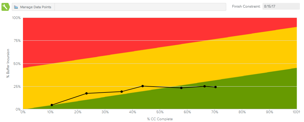
The black line graph shows the percentage of buffers consumed. The graph is created with the X-axis representing the percentage of the Critical Chain completed, and the Y-axis representing the percentage of the Project buffer consumed (incursion). If the % Buffer Incursion is higher than % CC Complete, the slope of the line will be greater than 45 degrees, and if the % Buffer Incursion is lower than the % CC Complete, the slope of the line will be less than 45 degrees.The green, yellow, and red zones tell us when to take action. As long as the buffer consumption line graph remains in the green zone, the project manager does not have any reason to worry about missing his project target date.
The buffer consumption line penetration into the yellow zone signals caution. This informs the Project Manager that the rate of buffer consumption just got steeper, and the scope and estimates on future tasks should be reviewed. There is still no need to take action, but one should be prepared just in case.
The buffer consumption line penetration into the red zone means the project is definitely off the rails and corrective action needs to be taken immediately. This may mean that some of the project tasks were not estimated accurately to begin with. The causes of the penetration needs to be investigated.
When several projects are selected, the Fever Chart displays the same axes (% CC Complete and % Project Buffer Incursion). However, there are two main differences in the chart:
The bubble chart displays one point for each of the selected projects.
Each bubble represents the current values of both fields, as opposed to coming from the snapshots (history) taken for the selected project.
Upon clicking the Manage Data Points ( ) command (available in mono-project selection only), the Logged Data Points dialog box is displayed, allowing Project Managers to review the points constituting the Fever Chart and providing the opportunity to delete any data points that have been captured by mistake.